Before i could begin designing my skin care brand i needed to be sure of the packaging. So i made some prototypes of what it may look like using packaging nets.I first tested these with paper. After testing these both out i decided i would probably go with the more complex net.


After testing these both out it was brought to my attention the complex net didnt look very good when put together especially with the stock i was going to use. It looked very large in the sense a product wouldn't be that wide. Although i could adjust the height and width of the other template i decided i would just use the simpler net as it looked more high end and minimal.
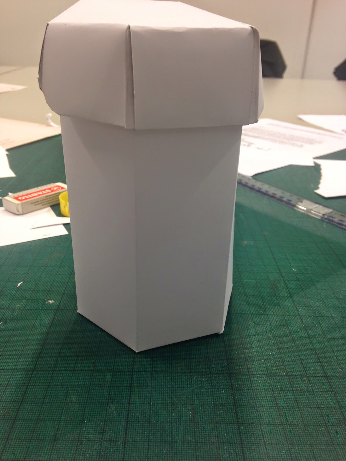
I liked the idea of the previous lid so i have decided to re-design the lid for the simpler net having 4 sides instead of 6.
New Lid -
Using the old net i designed my new one by having less sides and having double the width in the tabs so i would be able to make them thick. so the lid is sturdy. I will print this lid and test it before i go to print with the rest of the boxes.

Name-
i decided to name the brand ardour as i wanted my brand to reflect energy. I also think the name gives the product a high end feel.

Icons-

Logo-


Colour choices -

- Revitalize Mist - Ultra radiance facial re-hydrating mist - instantly enhances radiance to deliver immediate & long-term hydration.
-Healing - Intensive multi-purpose skin healing gel
-Moisture - total moisture facial cream - Hydra-concentrated facial cream
-Brightening Serum - Instant brightening facial serum.


TEST 1 -

RE-VISITED LOGO-


Variations with packaging with different colour design:


Test 2:


After this experiment i decided to use this design which i then refined by simply splitting the net in half so i could achieve a packing net that was more interactive. The purpose of the nets was for them to be durable and somthing aesthetically pleasing to keep.
Nets:


Mocked up prototypes:


Final nets and boxes:


APP - Proposal
If i was to extend the brief i would produce an app and website with detailed information for the products. To get an idea of what it might look like i quickly mocked up some App designs


For final year as noted in my PPP presentation I wanted to produce some
packaging as its not something I have done very much of the past three years
but its something I do like and appreciate the crafting and design that goes
into it. As I like cosmetics I decided I would produce a packaging range around
skincare. Having an influence by Moroccan
patterns I based the design around that theme. Taking elements from the
patterns and applying them to my design.
Problems I faced with the brief is that it took me a while to gain a
reason and a conceptual route for the brief. It took me a long time to think of
the name and also the colour scheme I struggled with. A lot of products on the
market are either over branded or extreme luxury where they actually lack any
design at all. Although I like minimal design some things I was researching didn’t
offer me any inspiration or influence at all. I think this Is what may of set
me back.
Strengths throughout this brief have been the actual final product. I don’t
find my crafting skills to be of a high standard and although it seemed not relevant
for me to produce packaging and design for a brief when my skills don’t lie in
that field still didn’t put me off trying - as I wanted to do it in third year
to produce some professional images for my portfolio. I found the images I took
to be really good to begin with as I went throughout the year I found more of
my images to be more successful. I can really see a change in my photography skills
and production throughout the year. I would of liked to re-photograph the
images but due to time constraints I didn’t feel it was priority but it would
be something I would like to do before adding it to my portfolio.
No comments:
Post a Comment