The Stationary Company - Initial Ideas/Development
When starting the brief i tried to do my own hand rendered typography which didn't really work out as well i had hoped i attempted using ink and sharpies.
Development:
Lining it up
Development
Testing it with different typefaces.
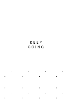
Although it was only monochrome i still wanted to design a pattern for the back of the calendar.
I still was unsure about the typeface so i kept developing.
Quote cards:
Patterns:
With these patterns i will print A2 and roll up and wrapping paper.
Using the same pattern i used on the calendars i expanded it and made it bigger.
Dotty Pattern:
Changed the typeface -
I next thought about stock i was going to use. I bought some off white baby blue and grey from hobby craft.
I still felt i wasn't getting anywhere so i changed the typeface to a san serif.
Using the pattern i applied to the postcard.
New quote cards:
Colour scheme.
Using the pattern.
Birthday cards:
For the birthday cards i needed to set up double sided layout so certain parts would print on certain places.
New Calendar :
Examples:
Full calendar: I also applied the original pattern to the back of this calendar too.
New cards:
Envelope:
For the envelope i decided i would make a simplistic one to fit in the postcards and quote cards.
Net:
Closed up.
Occasion cards:
Patterns/Booklets:
I made large patterns and cut out a booklet net so i could saddle stich the stock to the small notepads.
Print and production:
I rolled the wrapping paper up and attached a black string.
I cut the calendar down ready to be spiral bound.
Some of the colour cards i got printed turned out to be of poor quality so when i go to hobs to get my calendar spiral bound i will reprint these.
Patterned occasion cards.
Black type on grey card
Notepads:
I bound the notepads with thread like a booklet. I simply removed the staples from underneath and bound the cover with the pages.


No comments:
Post a Comment