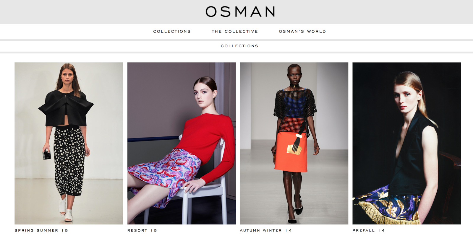
Me and Issy had planned to meet up on Friday both had produced a pattern for the bottle design for one of the designers we had chosen. I had said i would find a pattern from OSMAN. I first went on to the OSMAN STUDIO website and began looking at some of the designs they had on there website and choosing monochrome styles to recreate for the bottle.
Variation 1:
Using the pattern from the skirt i made a little set of the shapes and created a pattern using it.
Variation 2 :
I made the pattern by creating circles and lines to recreate the design from the tshirt.
Variation 3:
Variation 4:
Although this pattern was gold and black i felt it would work really well monochrome. I simply multiplied the circles to achieve the same feel as the playsuit in the image.
Original logo to be used -
I next mocked up the pattern full bleed on a banner style mockup with the logo across and the centre to see how the pattern would work against the logo.
Variation 1 :
Variation 2:
Variation 3:
Variation 4 :
I think i prefer the third variation the most with the blurry pattern. I think it looks minimal and classy and contemporary.
Issys Nom De mode print:
Henry Holland Print
Meeting 9th:
We drew out the word Prosseco please and scanned it in to apply to posters. Issy came up with the idea of having Polaroid images for our campaign that would work along side the app to promote the brand by hash tagging prosseco #prossecoplease
Issys Polaroids:
Box Packaging and net :


No comments:
Post a Comment